简介
BaseWPFControl 是一个 dll,基于 .net 8.0 和 WPF 框架实现,用于提供控件样式(包含基础控件和额外控件)。
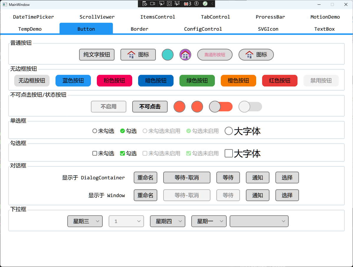
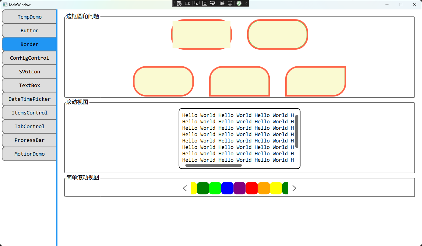
基础控件
重写了基础控件 Button 的样式。
- 新增
BaseWPFControl:ButtonProperty.Icon 附加属性用于提供按钮图标
- 提供圆角
 1
 2
 3
 4
 5
 6
 7
 8
 9
10
11
12
13
14
15
16
17
18
|
<Button Content="纯文字按钮" Margin="10" />

<Button Content="图标" Margin="10"
        BaseWPFControl:ButtonProperty.Icon="{StaticResource HomePage}" />

<Button Content="圆形按钮" Margin="10"
        Style="{StaticResource CircleButtonStyle}" />

<Button Content="带图标的圆形按钮" Margin="10"
        Style="{StaticResource CircleButtonStyle}"
        BaseWPFControl:ButtonProperty.Icon="{StaticResource HomePage}" />

<Button Content="跑道形按钮" Margin="10"
        Style="{StaticResource RoundButtonStyle}" />

<Button Content="图标" Margin="10"
        Style="{StaticResource RoundButtonStyle}"
        BaseWPFControl:ButtonProperty.Icon="{StaticResource HomePage}" />
|

针对不启用和不可点击的按钮,做出了区分,分别对应 IsEnabled 和 IsHitTestVisible 属性。
1
2
|
<Button Content="不启用" IsEnabled="False" Margin="10" />
<Button Content="不可点击" IsHitTestVisible="False" Margin="10" />
|
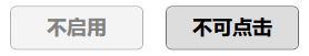
之所以这样去做目的是为了 GPIO 的控制,GPI 不可点击,GPO 可点击。
提供了两种相似的样式 BooleanStateButtonStyle 和 BooleanToggleButtonStyle。前者对应于 GPI,不可点击,仅用于展示 GPI 状态,后者对应于 GPO,既可以展示 GPO 状态,又可以通过点击切换状态。
1
2
3
4
|
<Button Style="{StaticResource BooleanStateButtonStyle}" Margin="10"
        Tag="{Binding State}" />
<Button Style="{StaticResource BooleanToggleButtonStyle}" Margin="10"
        Tag="{Binding State}" Command="{Binding ChangeStateCommand}" />
|


基于 ToggleButton 重写样式,该控件的本意是用于 GPIO 的控制
1
2
3
|
<ToggleButton IsChecked="{Binding State}" Margin="10" />

<ToggleButton IsChecked="{Binding State}" Margin="10" IsEnabled="False" />
|


最终方案如下:
GPI 使用 Button 的 BooleanStateButtonStyle 样式GPO 使用 ToggleButton 的默认样式。
重写 RadioButton 的样式,主要优化如下:
- 勾选后样式变化
- 勾选框尺寸跟随字体尺寸变化
1
2
3
4
5
|
<RadioButton Content="未勾选" />
<RadioButton Content="勾选" IsChecked="True" />
<RadioButton Content="未勾选未启用" IsEnabled="False" IsChecked="False" />
<RadioButton Content="勾选未启用" IsEnabled="False" IsChecked="True"  />
<RadioButton Content="大字体" FontSize="30" />
|

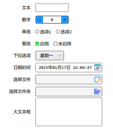
CheckBox
重写 CheckBox 的样式,主要优化如下:
- 勾选后样式变化
- 勾选框圆角
- 勾选框尺寸跟随字体尺寸变化
1
2
3
4
5
|
<CheckBox Content="未勾选" />
<CheckBox Content="勾选" IsChecked="True" />
<CheckBox Content="未勾选未启用" IsEnabled="False" IsChecked="False" />
<CheckBox Content="勾选未启用" IsEnabled="False" IsChecked="True" />
<CheckBox Content="大字体" FontSize="30" />
|

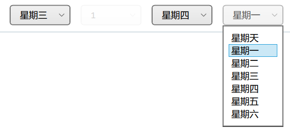
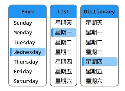
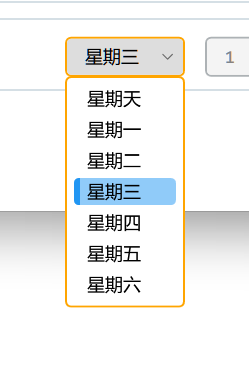
ComboBox
重写 ComboBox 样式,主要优化如下:
- 圆角属性
- 提供 ComboBox 绑定枚举值的扩展语法 EnumBindingSource
 1
 2
 3
 4
 5
 6
 7
 8
 9
10
11
12
13
14
15
16
17
18
19
20
21
22
23
24
25
26
27
28
29
30
31
32
|
<!--示例1:ComboBox绑定枚举值-->
<ComboBox Margin="10" Width="120"
          ItemsSource="{BaseWPFControl:EnumBindingSource
                                        EnumType=BaseTest:EnumDayOfWeek}"
          SelectedItem="{Binding SelectedEnumDayOfWeek}" >
    <ComboBox.ItemTemplate>
        <DataTemplate>
            <TextBlock Text="{Binding
                       Converter={StaticResource EnumToDescriptionConverter},
                       Mode=OneWay}" />
        </DataTemplate>
    </ComboBox.ItemTemplate>
</ComboBox>

<!--示例2:不启用ComboBox-->
<ComboBox Margin="10" Width="120" IsEnabled="False" >
    <ComboBoxItem Content="1" IsSelected="True" />
</ComboBox>

<!--示例3:ComboBox绑定字典-->
<!--note:需要设置 DisplayMemberPath 和 SelectedValuePath,-->
<!--note:并只能使用 SelectedValue 进行访问-->
<ComboBox Margin="10" Width="120" ItemsSource="{Binding DictionaryDayOfWeek}"
          DisplayMemberPath="Value" SelectedValuePath="Key"
          SelectedValue="{Binding SelectedDictionaryDayOfWeek}" />

<!--示例4:ComboBox绑定列表-->
<!--note:使用 SelectedItem 或者 SelectedValue 都可以获得正确结果-->
<!--note: 前提是绑定的值在列表中,也可以通过 SelectedIndex 进行访问-->
<ComboBox Margin="10" Width="120" ItemsSource="{Binding ListDayOfWeek}"
          SelectedItem="{Binding SelectedListDayOfWeek}" />
|
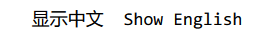
TextBlock
重写 TextBlock 的样式,主要优化如下:
- 中英文使用不同的字体显示,中文使用
微软雅黑,英文使用Consolas
1
2
|
<TextBlock Text="显示中文" Margin="10" />
<TextBlock Text="Show English" Margin="10" />
|
MemoryBlock
该控件为自定义控件,主要实现以下功能:
- 获取当前软件已使用内存,以
MB 为单位
- 可以通过控件的
Interval 属性设置更新频率,单位为 ms,默认为 1000 ms
- 可以通过控件的
Header 属性设置前缀文字
- 可以通过控件的
UsedMemory 只读属性获取内存
1
|
<BaseWPFControl:MemoryBlock Margin="10" />
|

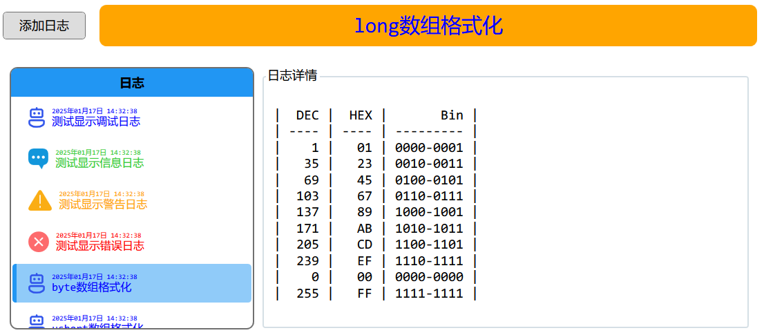
LogBlock
该控件为自定义控件,配合 BaseLogManager 一起使用,主要实现以下功能:
- 显示日志
- 提供日志详情页
1
2
3
4
|
<BaseWPFControl:LogBlock x:Name="LogBlock_Test" />

<ContentControl Height="400" Margin="10"
                Content="{Binding ElementName=LogBlock_Test, Path=LogView}" />
|
TextBox
重写 TextBox 的样式,主要实现以下功能:
- 可以通过
TextBoxProperty.Prefix 属性设置前缀文字
- 可以通过
TextBoxProperty.WaterMask 属性设置水印文字
- 可以通过
TextBoxProperty.Suffix 属性设置后缀文字
- 输入时边框高亮显示
- 大文本输入框可以通过滚动条上下滚动
 1
 2
 3
 4
 5
 6
 7
 8
 9
10
11
|
<TextBox Width="200" Margin="10"
BaseWPFControl:TextBoxProperty.Prefix="www."
BaseWPFControl:TextBoxProperty.Suffix=".com"
BaseWPFControl:TextBoxProperty.WaterMask="输入网址" />
<TextBox Width="160" Margin="10" Text="默认文本框" />
<TextBox Width="100" Margin="10"
BaseWPFControl:TextBoxProperty.WaterMask="绑定Decimal类型"
Text="{Binding DecimalNumber, StringFormat=0.#}" />
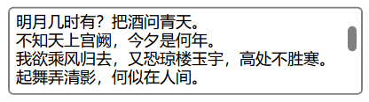
<TextBox Style="{StaticResource BigTextBox}"
Width="400" Height="100" Margin="10" Text="{Binding Poetry1}" />
|

NumericBox
NumericBox 为自定义控件,主要实现以下功能:
- 更方便的绑定数字,并提供限制
- 可以通过
Value 属性获取/设置值
- 可以通过
TextFormat 属性设置文本格式
- 可以通过
MinValue 属性设置最小值
- 可以通过
MaxValue 属性设置最大值
- 可以通过
Interval 属性设置点击增减按钮时的变化量
- 可以通过
ValueChanged 事件获取值改变事件
1
2
3
4
5
|
<BaseWPFControl:NumericBox Value="{Binding DecimalNumber}" TextFormat="0.#"
                           MinValue = "0" MaxValue = "100" Interval = "1"
                           ValueChanged="NumericBox_ValueChanged" />
<BaseWPFControl:NumericBox Value="{Binding DecimalNumber}" TextFormat="0.#"
                           IsEnabled="False" />
|

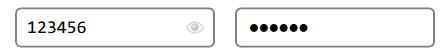
PasswordBox
重写 PasswordBox 样式,主要实现以下功能:
- 可以通过
PasswordBoxProperty.CanShowPassword 属性设置是否显示密码的功能
1
2
3
|
<PasswordBox Width="200" Margin="10" Password="123456" />
<PasswordBox Width="200" Margin="10" Password="123456"
             BaseWPFControl:PasswordBoxProperty.CanShowPassword="False" />
|
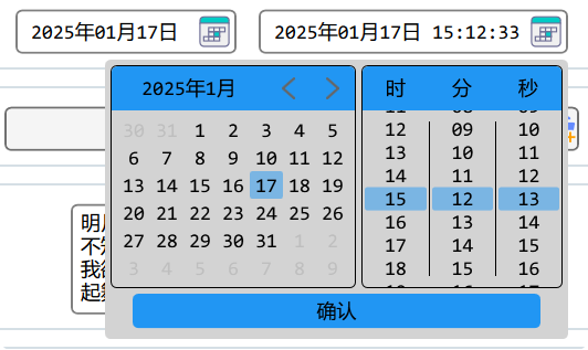
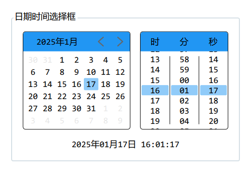
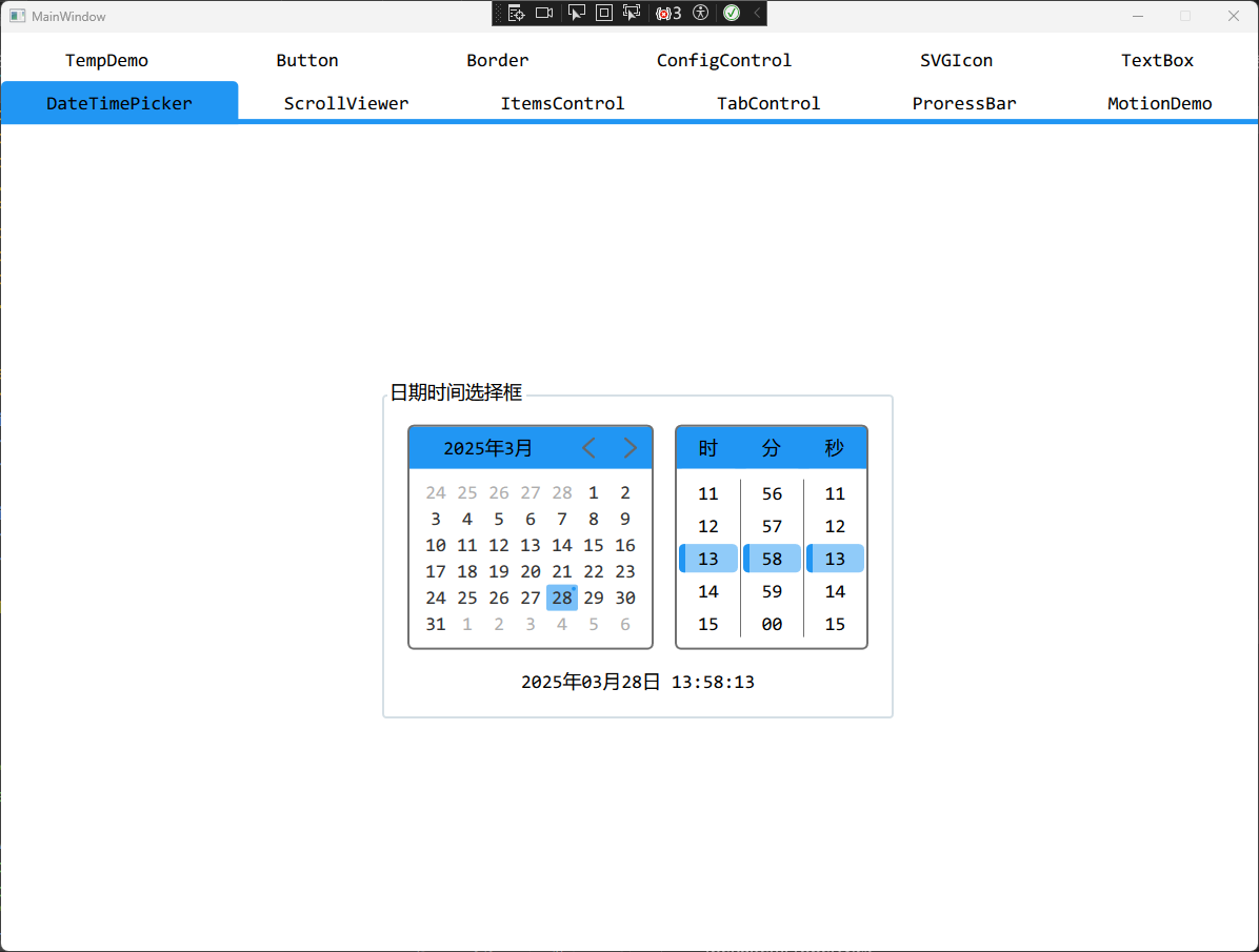
DatePicker & DateTimePicker
DatePicker 和 DateTimePicker 都是自定义控件,主要实现以下功能:
- 选择时间和日期,这两个控件的区别在于一个前者只有日期,后者包含时间
- 可以通过
SelectedDateTime 获取选中的日期时间
- 可以通过
SelectedDateTimeFormat 设置日期时间的格式
- 可以通过
SelectedDateTimeChanged 获取时间改变的事件
1
2
|
<BaseWPFControl:DatePicker Margin="10" />
<BaseWPFControl:DateTimePicker Margin="10" />
|
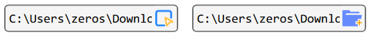
SelectFileBlock & SelectFolderBlock
SelectFileBlock 和 SelectFolderBlock 都是自定义控件,主要实现以下功能:
- 点击按钮通过对话框选择文件或者文件夹
- 可以通过
SelectedPath 属性获取/设置路径
- 可以通过
SelectedPathChanged 获取选中路径改变的事件
SelectFileBlock 可以通过 ExtensionFilter 属性设置文件过滤- 鼠标移动到文字上方出现
ToolTip 显示路径的全文
- 鼠标双击文字直接跳转到路径所在的文件夹
Image
提供一些内置的 SVG,可以直接通过 Source 绑定 StaticResource 值进行设置
1
|
<Image Source="{StaticResource DirectoryConfig}" Height="50" Margin="10" />
|
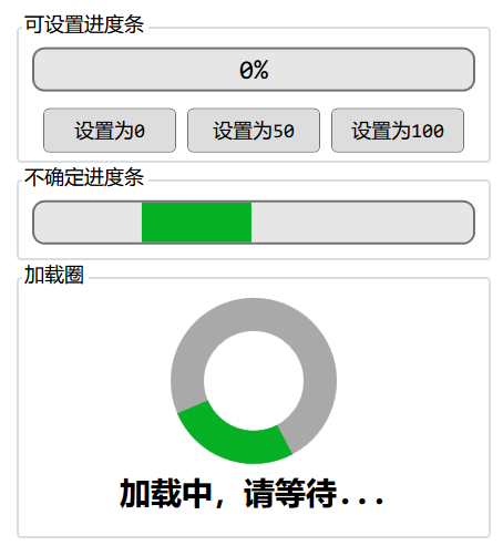
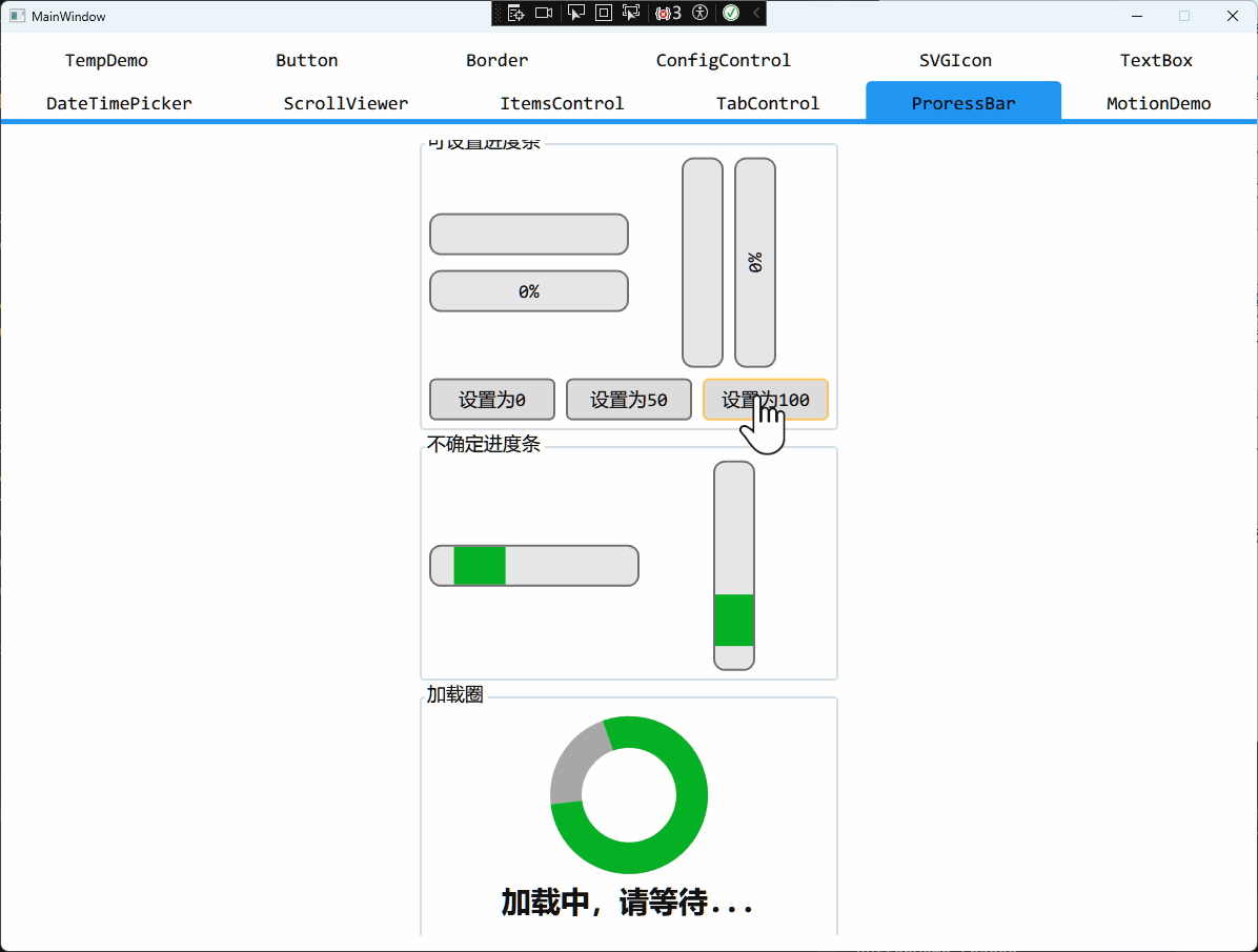
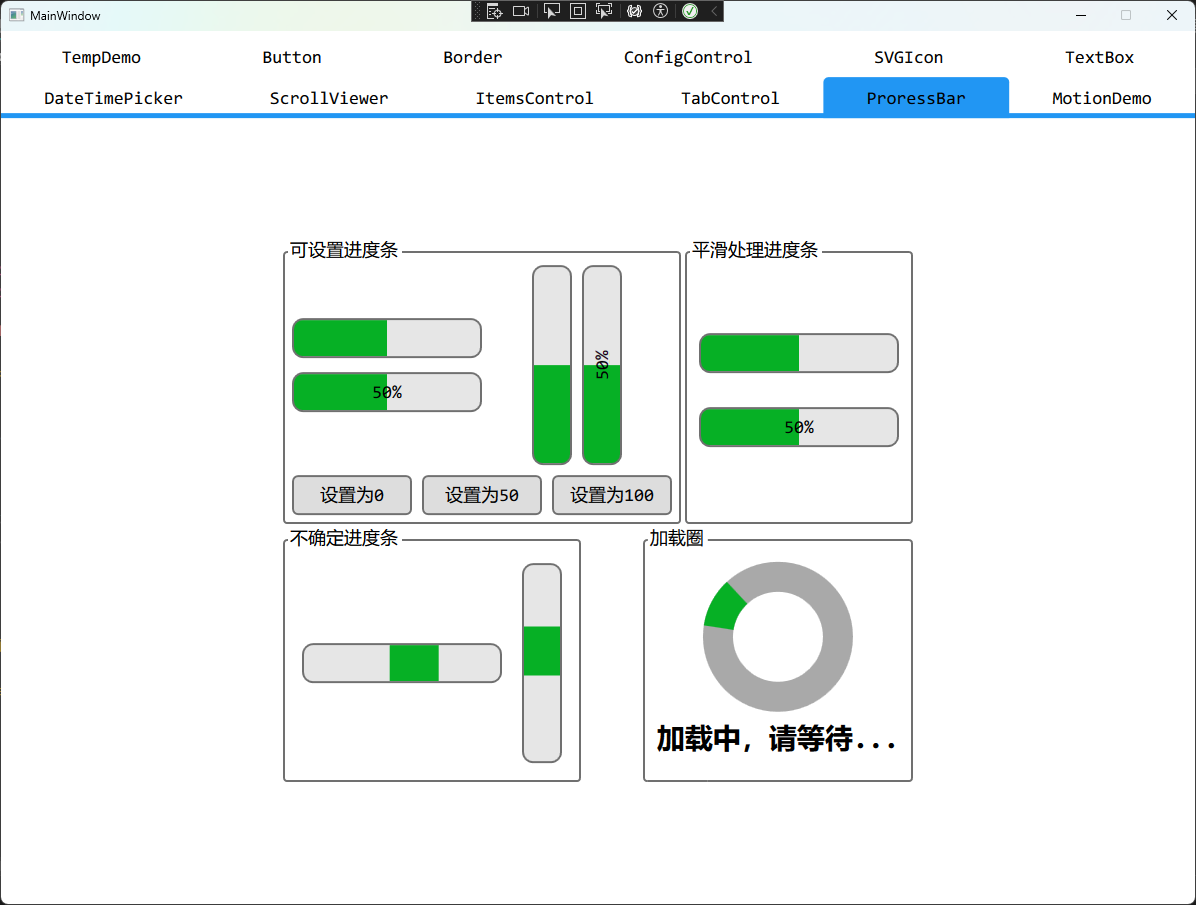
ProgressBar & Loading
- 重写
ProgressBar 样式,提供圆角
- 可以通过
ProgressBarProperty.ShowValue 属性设置进度条显示当前值
- 提供扩展函数
SetAnimateValue 设置进度条的值,通过该函数设置可以显示动画
- 提供自定义控件圆形进度条
Loading,仅用于等待功能
1
2
3
4
|
<ProgressBar Height="40" Width="400" d:Value="20"/>
<ProgressBar Height="40" Width="400" IsIndeterminate="True"/>
<BaseWPFControl:Loading Diameter="150" StrokeThickness="30"
                        Content="加载中,请等待..." />
|
Clock & Calendar
- 重写
Calender 样式
- 提供 自定义控件
Clock,用于选择时间
1
2
3
|
<Calendar x:Name = "Calendar" />

<BaseWPFControl:Clock Height="{Binding ActualHeight, ElementName=Calender}"/>
|
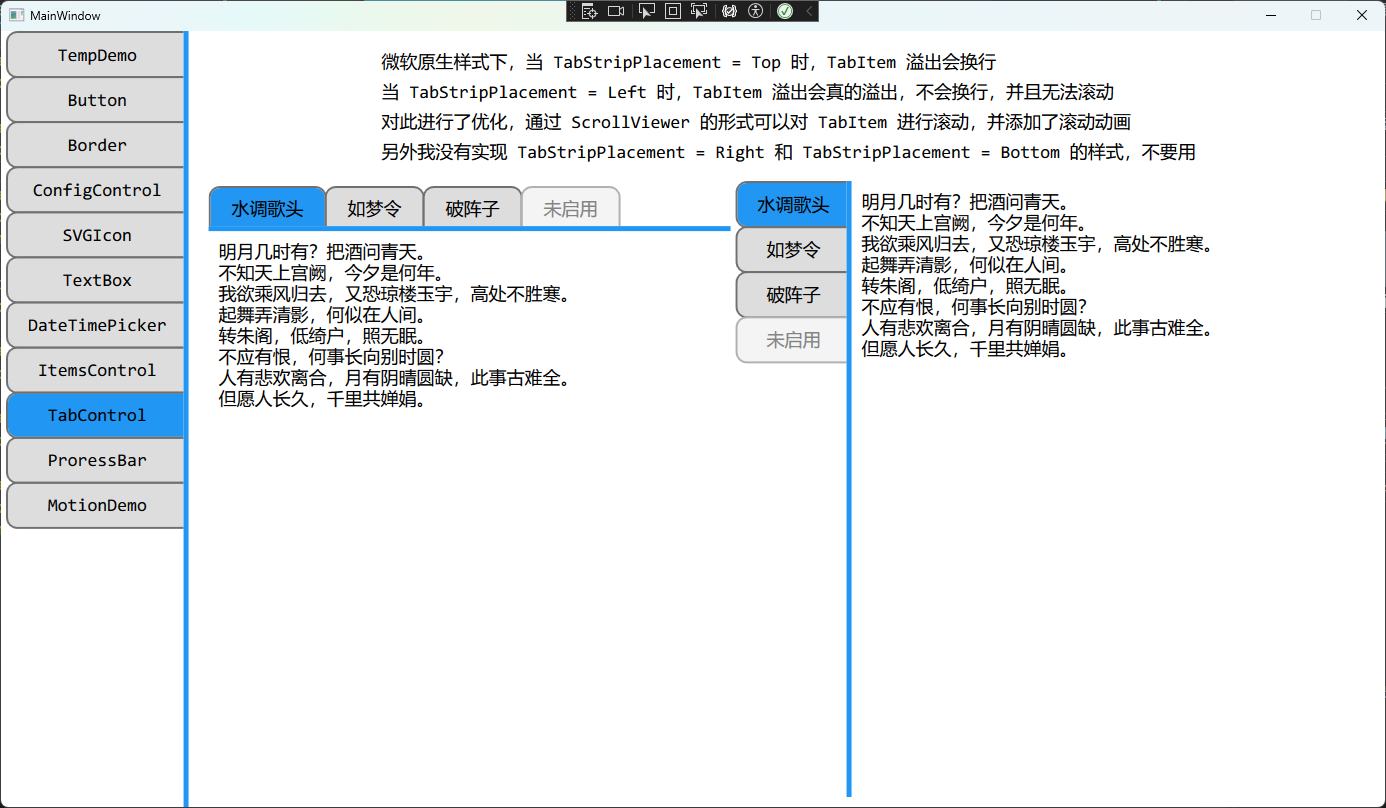
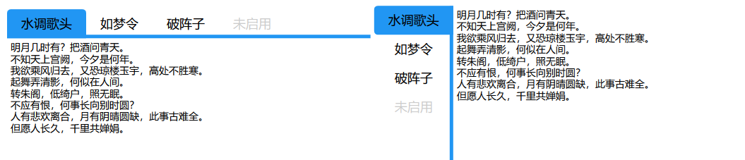
TabControl
重写 TabControl 的样式
 1
 2
 3
 4
 5
 6
 7
 8
 9
10
11
12
|
<TabControl TabStripPlacement="Left">
    <TabItem Header="水调歌头" >
        <TextBlock Text="{Binding Poetry1}" FontSize="14" />
    </TabItem>
    <TabItem Header="如梦令" >
        <TextBlock Text="{Binding Poetry2}" FontSize="14" />
    </TabItem>
    <TabItem Header="破阵子" >
        <TextBlock Text="{Binding Poetry3}" FontSize="14" />
    </TabItem>
    <TabItem Header="未启用" IsEnabled="False" />
</TabControl>
|
复杂控件
ConfigControl
提供自定义控件 ConfigControl,用于方便的实现配置界面
1
2
3
4
5
6
7
|
<BaseWPFControl:ConfigControl ConfigName="日期时间">
    <BaseWPFControl:DateTimePicker />
</BaseWPFControl:ConfigControl>

<BaseWPFControl:ConfigControl ConfigName="选择文件">
    <BaseWPFControl:SelectFileBlock Width="280" />
</BaseWPFControl:ConfigControl>
|
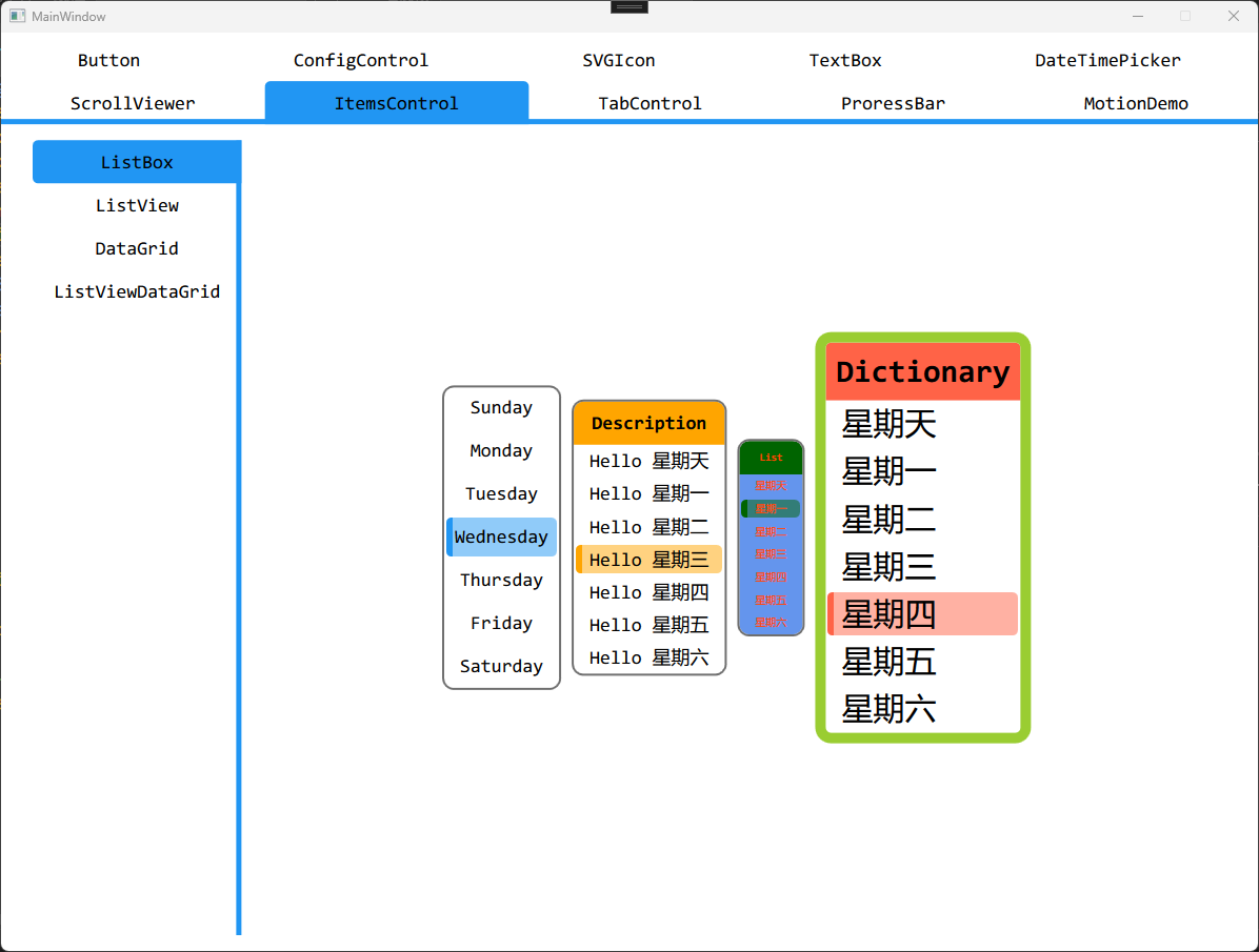
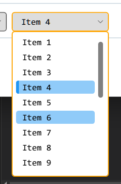
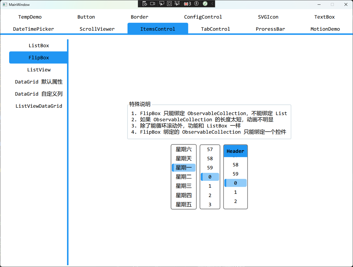
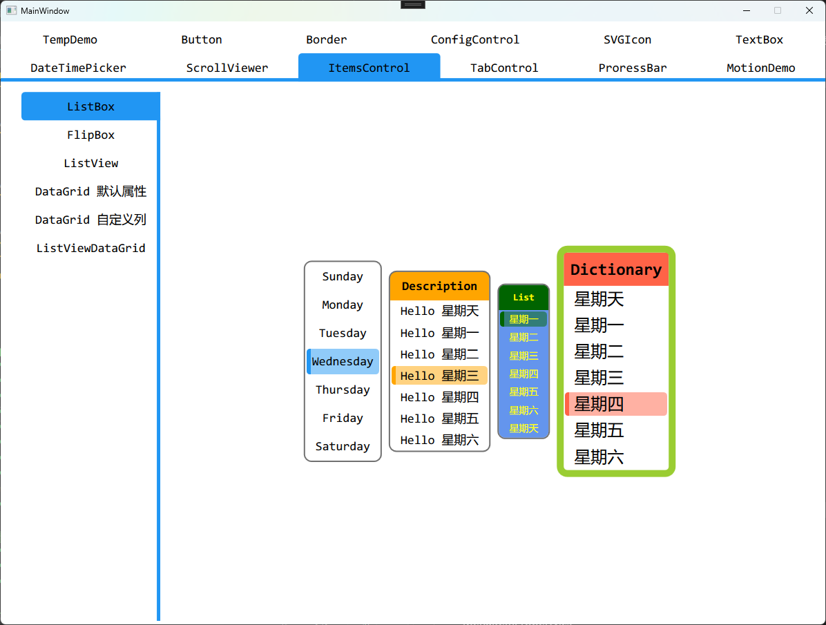
LisBox
重写 ListBox 的样式,可以绑定 Enum/List/Dictionary
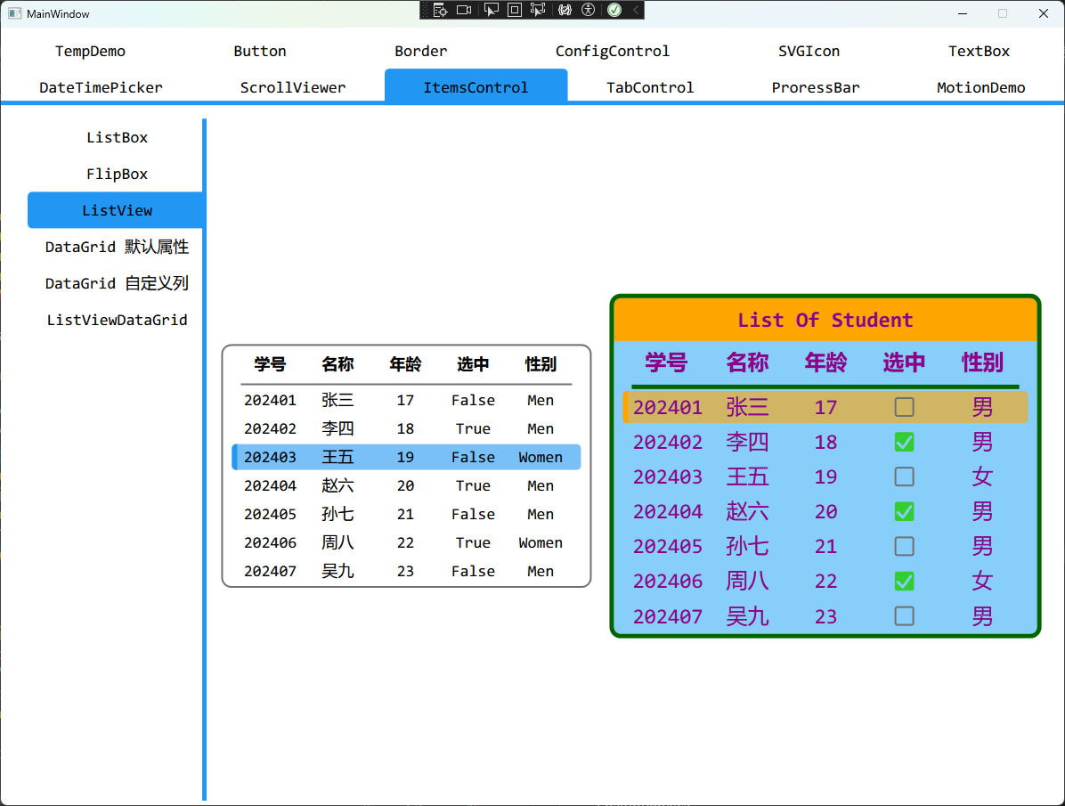
ListView
- 重写
ListView 的样式
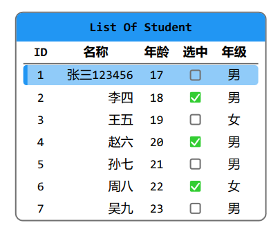
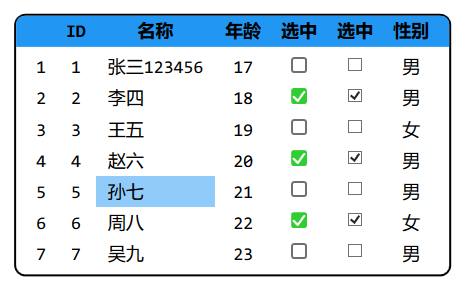
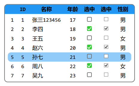
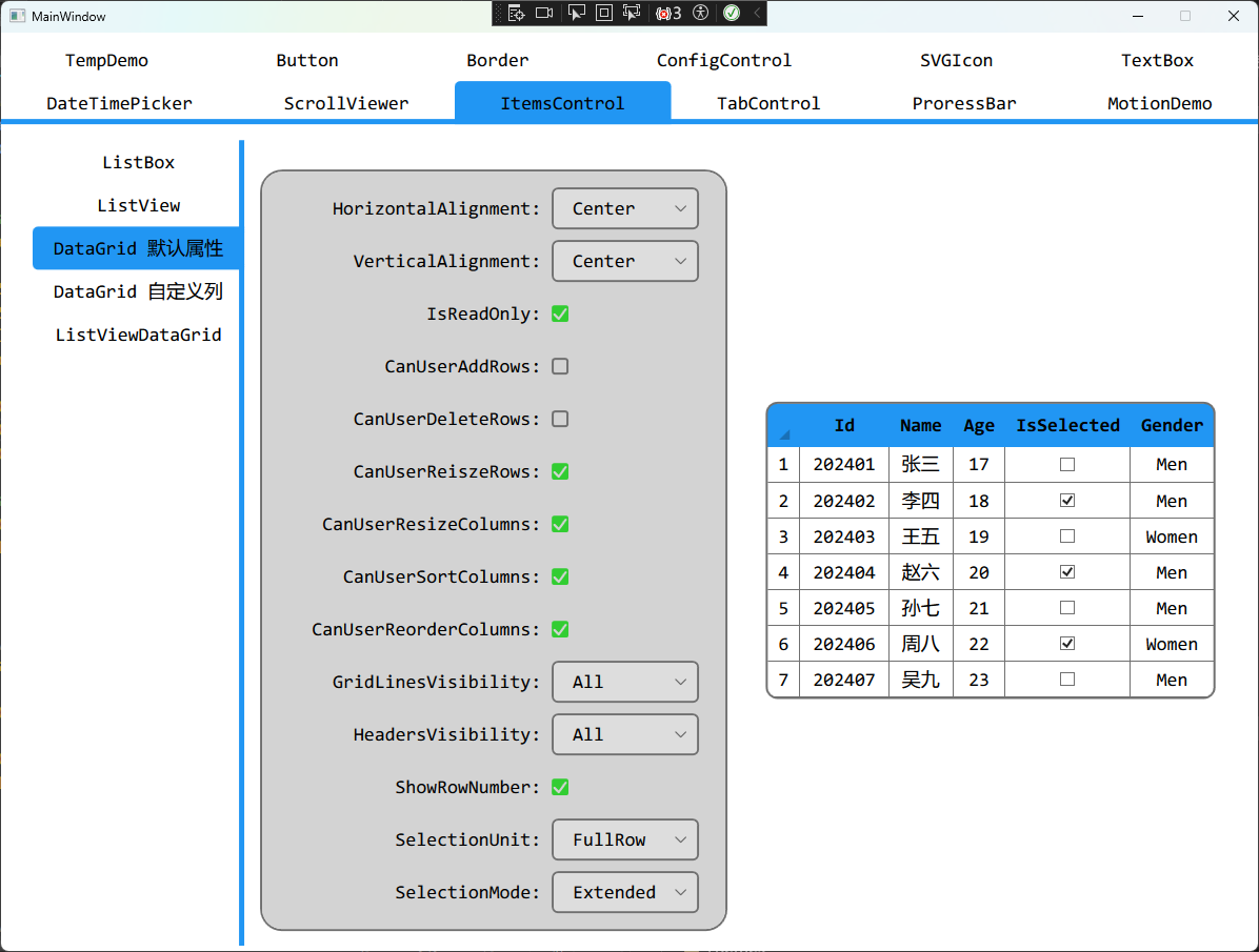
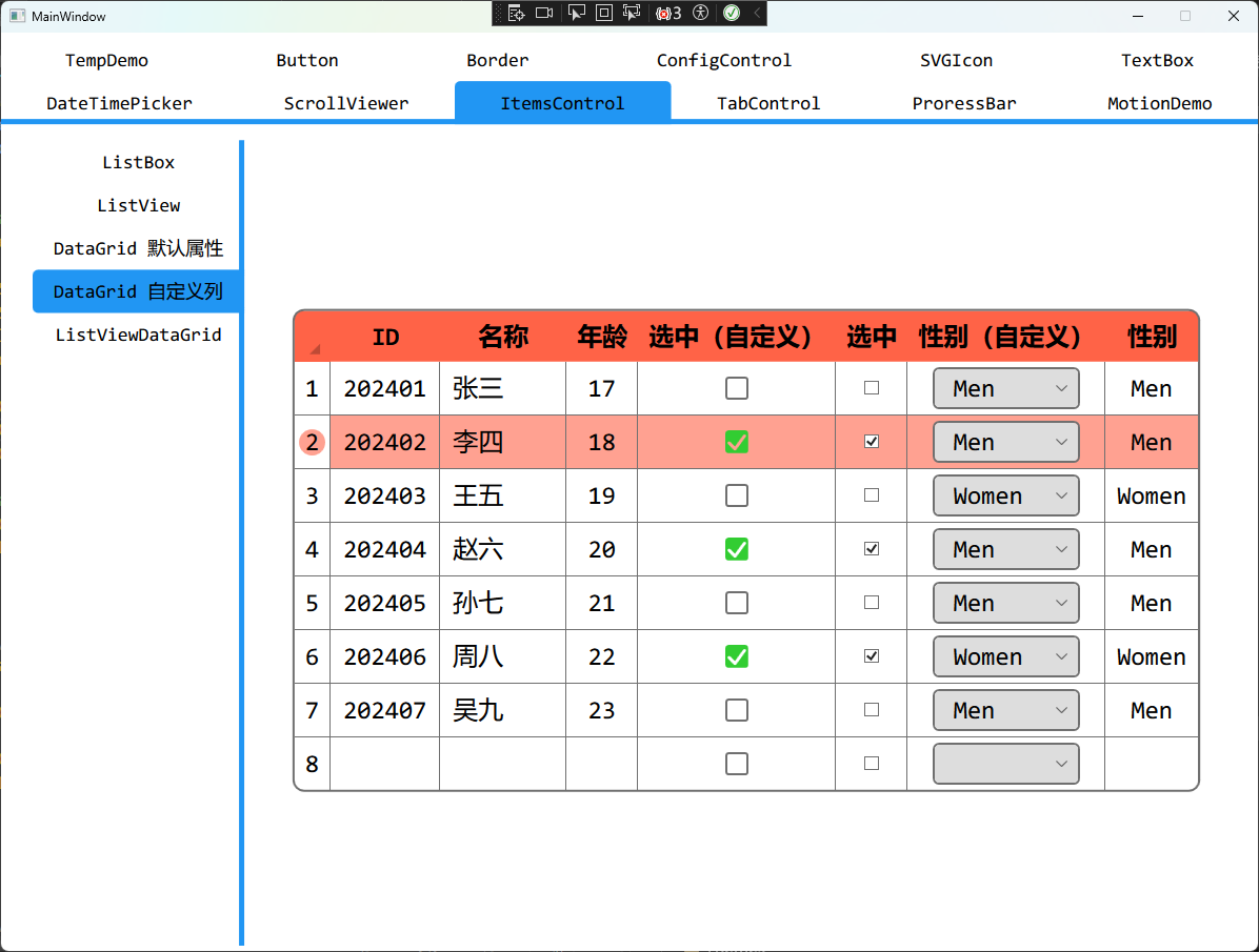
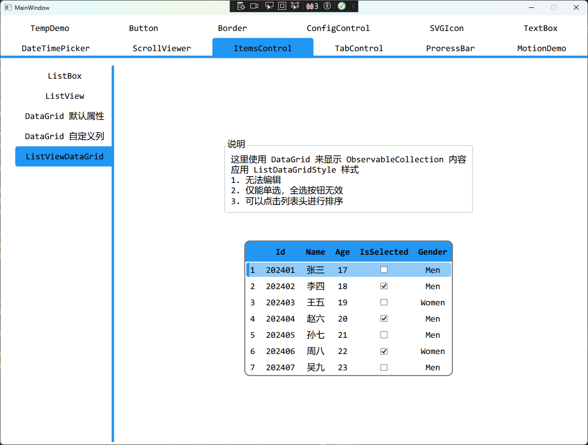
DataGrid
重写 DataGrid 的样式,这里包含两种样式,一种是选择单元格,另一种是鼠标经过选中整行
更新记录
更新了部分 BaseWPFControl 中的控件,实现了更多的功能。
优化ListBox
实际使用了一下ListBox之后发现还是有很多问题,尤其是关于调整属性之后,并且给出了更多的示例
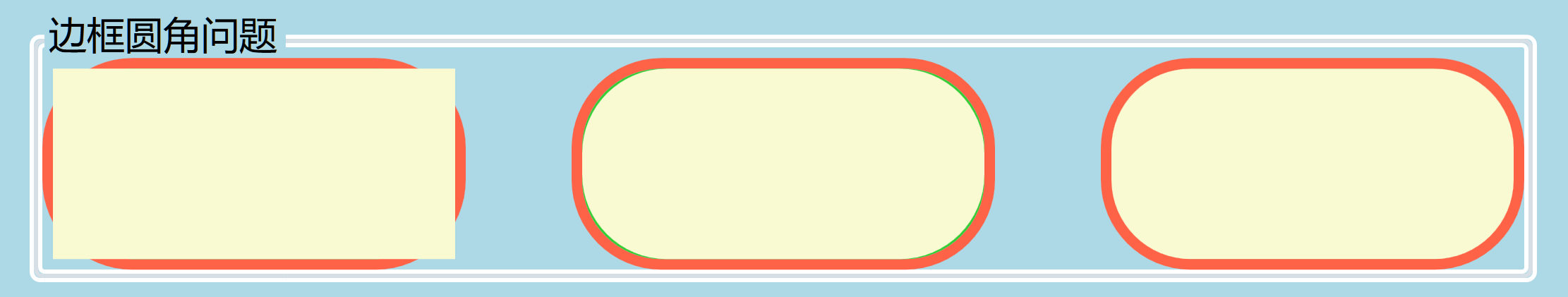
新增BaseClipBorder
- 实现了新的控件
BaseClipBorder来解决边框溢出和边框圆角缝隙的问题
- 最终实现如右图所示
优化ProgressBar
- 在上面
BaseClipBorder的基础上优化了ProgressBar的实现
- 给出了垂直
ProgressBar例程实现
新增DefaultControlStyle和DefaultWindowStyle
这样设计的原因其实是为了移除掉TextBlock的FontSize属性和FontFamily属性,改为直接从Window或者UserControl中继承字体属性。
而DefaultControlStyle中定义了基础的FontSize和FontFamily样式,并且任何控件都可以使用。
- 删除了关于
ButtonShape属性的内容
- 新增了一些无边框按钮的样式
- 统一了
BorderBrush和BorderThickness的风格
优化ComboBox
- 重写了
ComboBox的样式
- 新增
ComboBoxItem的样式
新增InnerSeparator属性
- 新增
BaseWPFControl:ControlProperty.InnerSeparator属性,一般用于内部存在间隙属性调整
1
2
3
|
<Button Content="图标" Margin="10"
        BaseWPFControl:ButtonProperty.Icon="{StaticResource HomePage}"
        BaseWPFControl:ControlProperty.InnerSeparator="20" />
|
优化DataGrid
在使用DataGrid的时候,我发现有些属性没有效果,或者不尽如人意。
所以我就重新整理了一下DataGrid的实现,并且给出了详细的案例。
优化Calendar和Clock
优化FlipBox
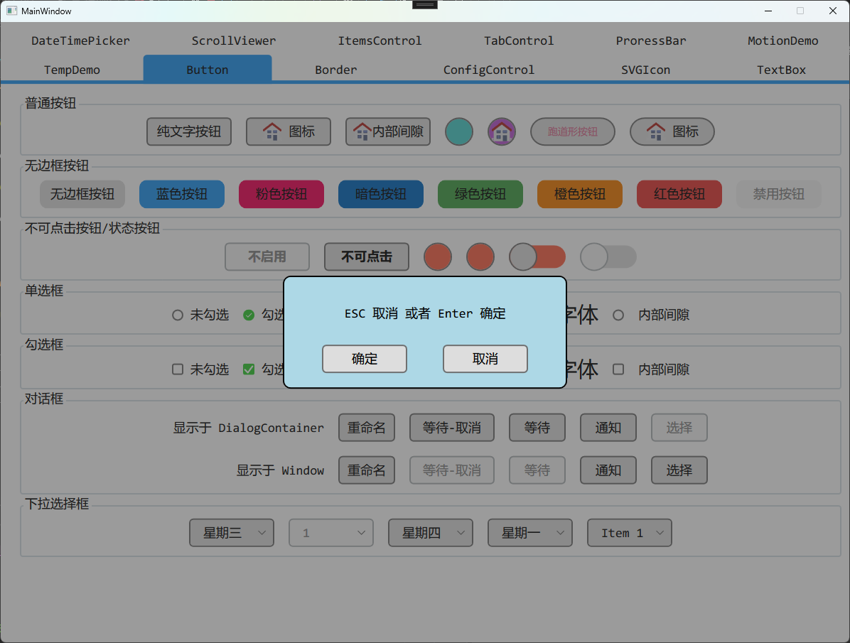
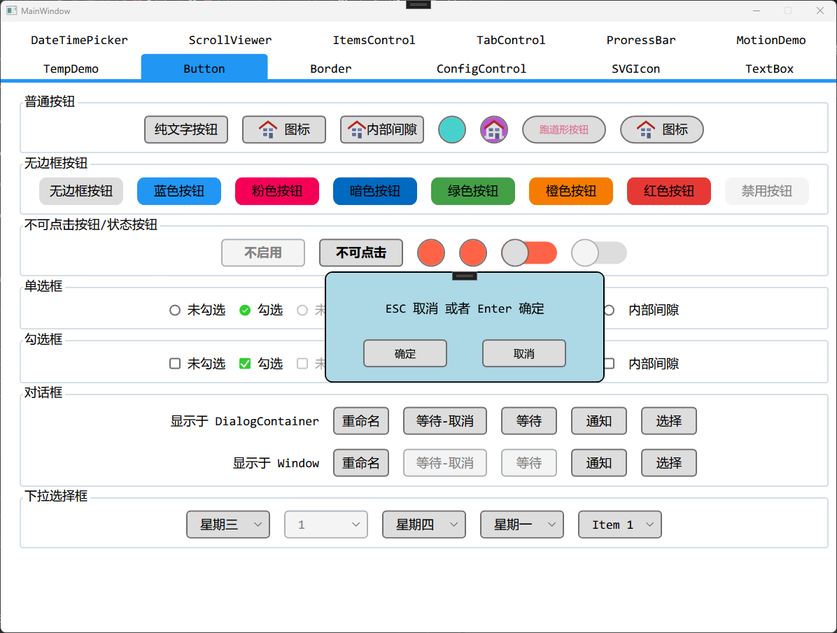
新增Dialog显示成Window
可以调用ShowDialogAsWindow函数,将Dialog显示成独立的Window,就算没有DialogContainer也能显示。使用体验和WPF原生的ShowDialog函数类似。
优化ListBox
和之前的显示一致,只是使用BaseClipBorder简化了内部实现。
优化ListView
优化SmoothProgress
这里省事,直接让SmoothProgressBar使用ProgressBar的样式
- 该样式没有滚动条,只有箭头按钮,并且增加了滚动动画
- 主要用于
TabControl的Header部分
优化TabControl